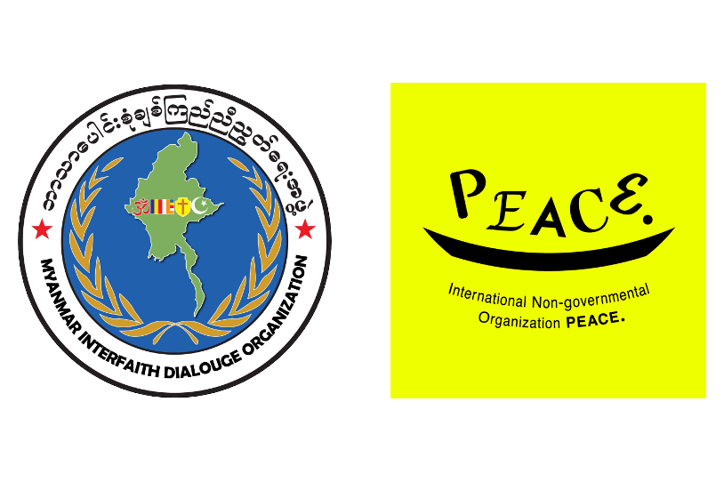
The Spirit Within the ingo PEACE. Logo
Our new symbol logo for ingo PEACE. is more than a design—it is the embodiment of our essence, our mission, and our heartfelt desire to support life in all its forms.
We envision a world where everyone, especially those who may still be vulnerable, can live in peace and security.
A world where a gentle hand is always there to catch you when you stumble.
A world where every voice and every heartfelt wish is truly heard and held.
To express this vision, each letter in the word “PEACE.” was purposefully crafted in a different typeface—symbolizing diversity in its purest form.
Like cultures, histories, languages, and races, no two letters are the same.
And yet, together, they spell a single, powerful word—PEACE.
Beneath the letters flows a black curved line, softly cradling them like a boat, a vessel, a safety net.
This line represents ingo PEACE. itself—quiet, steady, and always ready to hold space for others.
The bright fluorescent yellow backdrop is a beacon of peace and hope.
And the letters, rendered in black—the color formed when all others merge—speak of dialogue, inclusion, and unity.
Simple enough for a child to draw by hand, this logo invites everyone to imagine—What dreams, what hopes, will we place in this boat called PEACE?
It is a design with room to grow, open to each person’s imagination, evolving with every encounter.
Even without the name “ingo PEACE.” stamped upon it,
this color and shape will remind people: This too belongs to PEACE.
That is the kind of familiarity and timelessness we cherish and carry forward.
A future where many different hopes sail together in one boat—
That is the vision of PEACE we strive to bring to life.